Beauty Bay Rebrand
Creative direction, graphic direction, packaging direction, brand guidelines.
Brief: Lead the creative evolution of Beauty Bay through a full brand refresh that repositiones the business as bold, fresh, and elevated within an increasingly saturated beauty market. The rebrand focuses on modernising the visual identity and introducing a cohesive new packaging system that feels premium, intentional, and desirable while still remaining accessible to the next generation of beauty consumers. The objective is to build stronger brand recognition, increase perceived value, and create a unified ecosystem across product, digital, and campaign touch points.
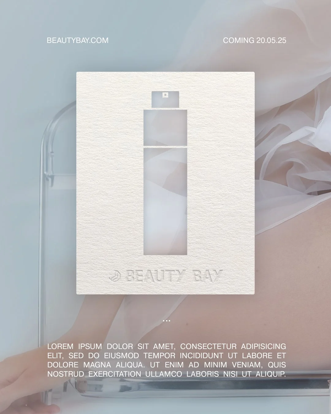
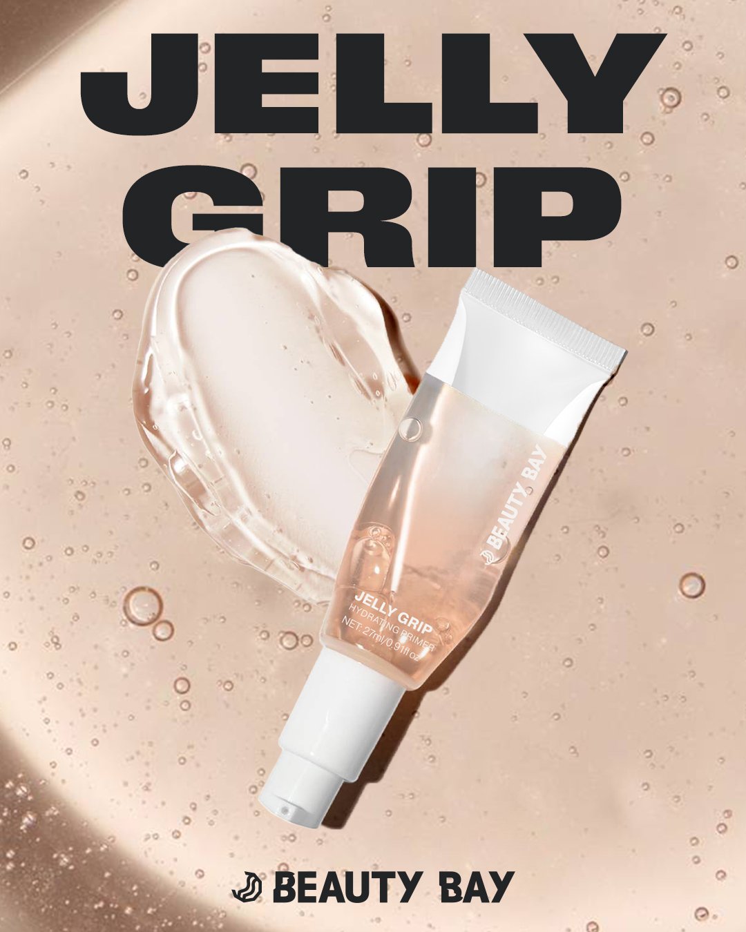
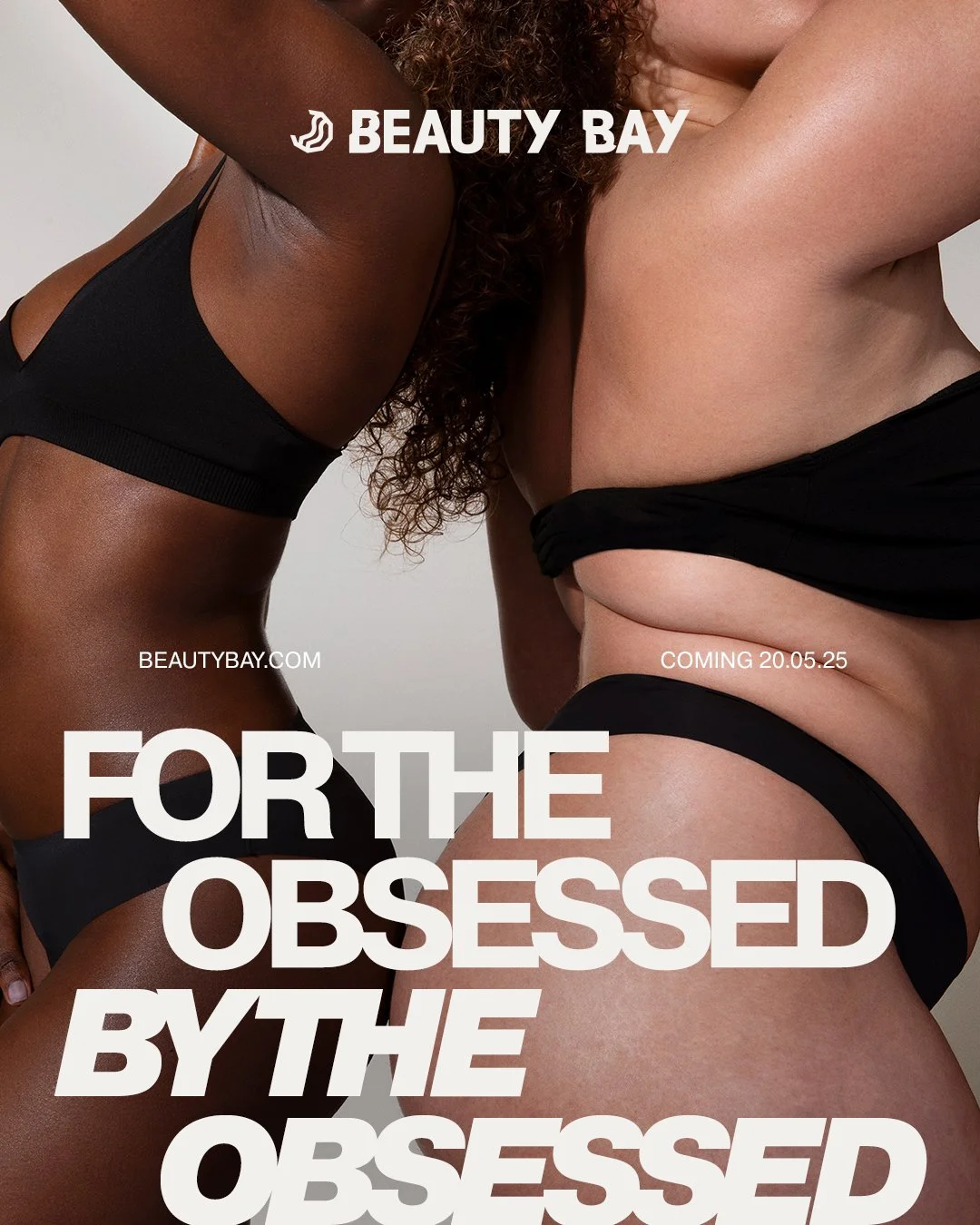
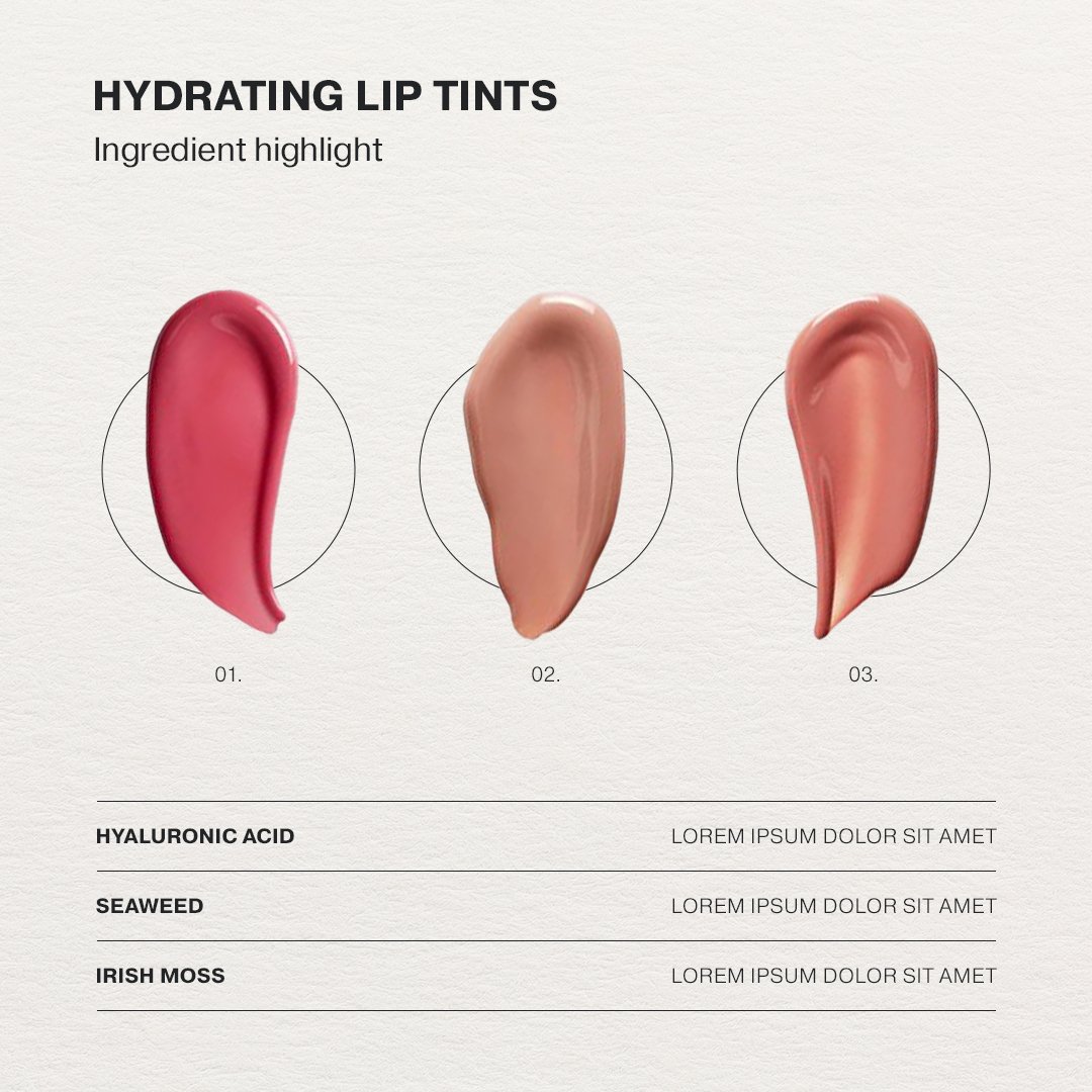
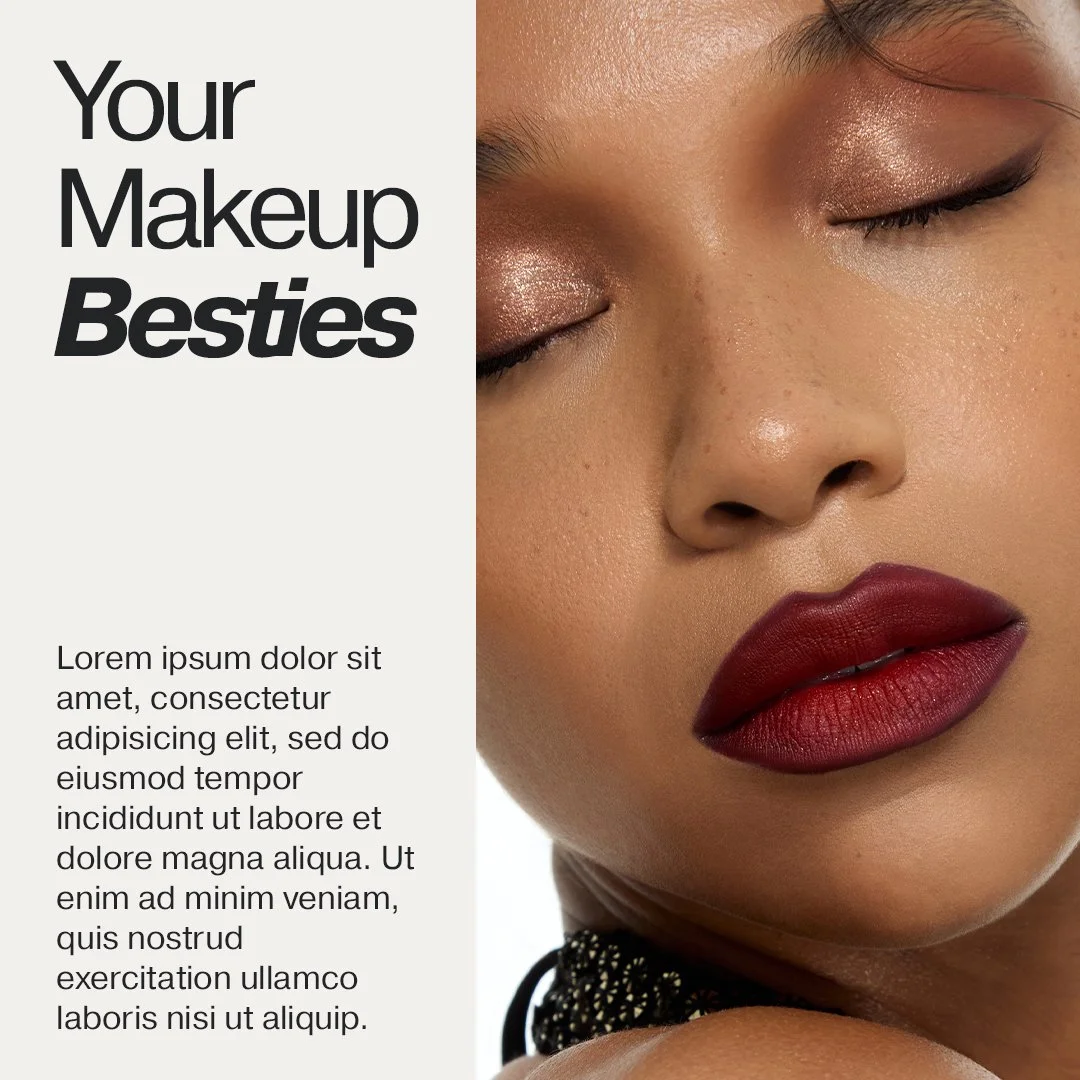
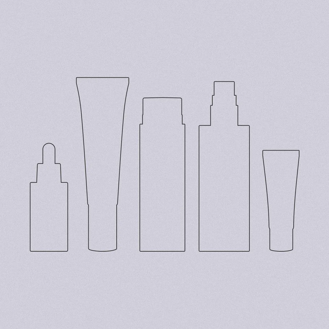
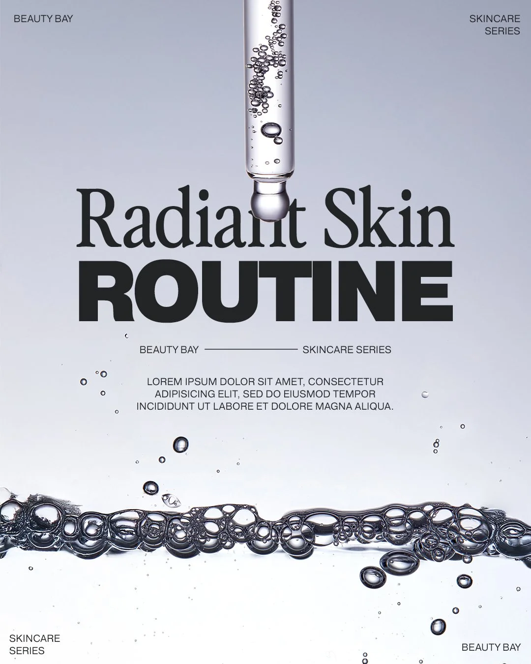
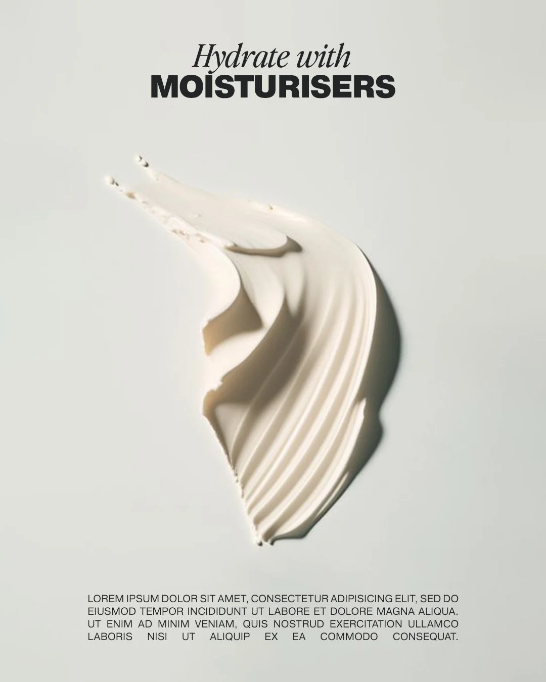
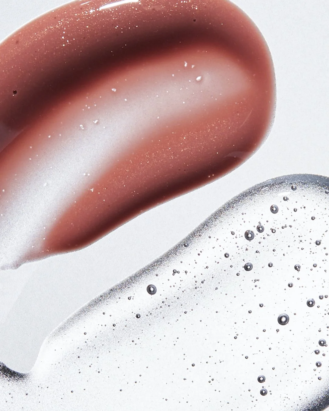
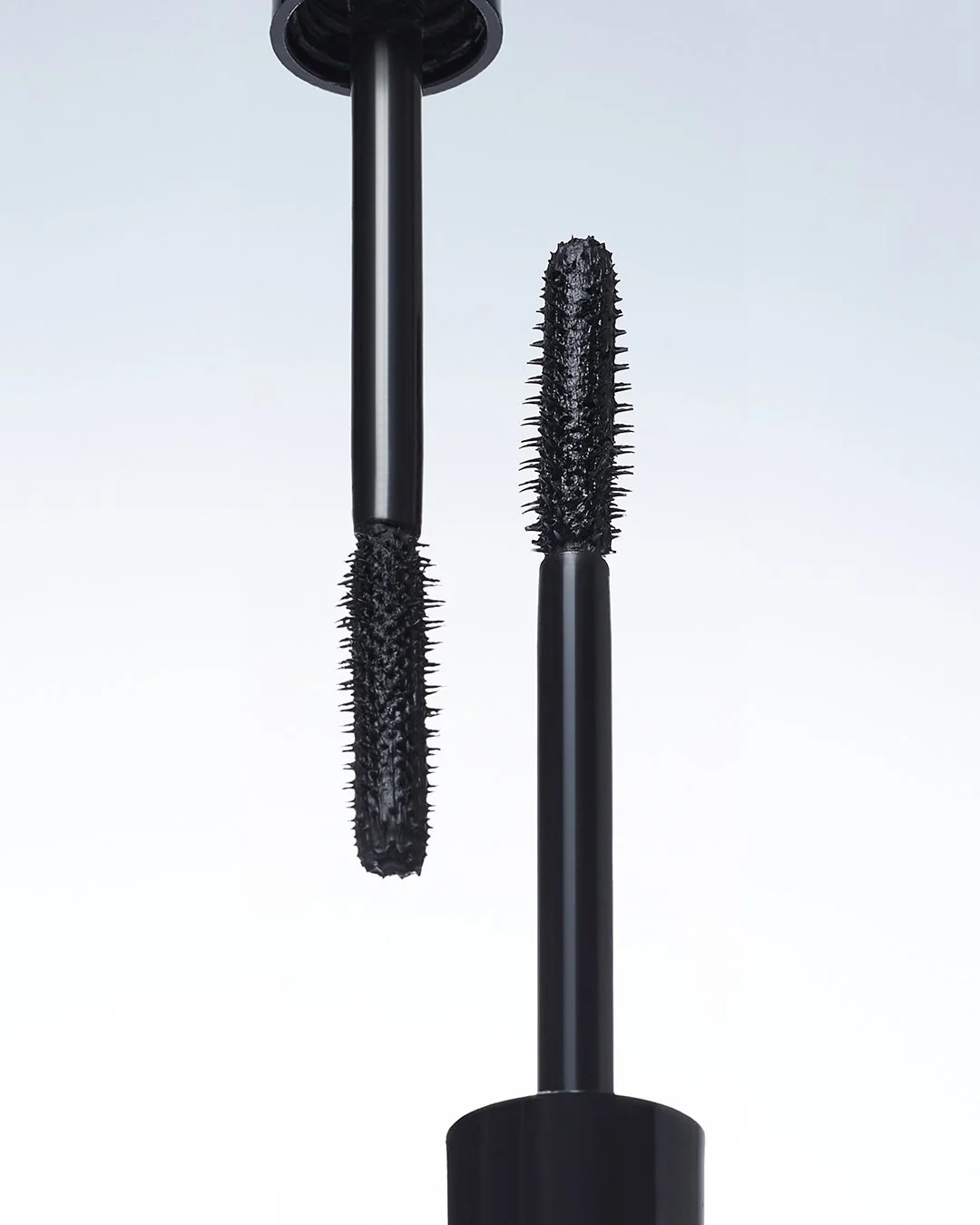
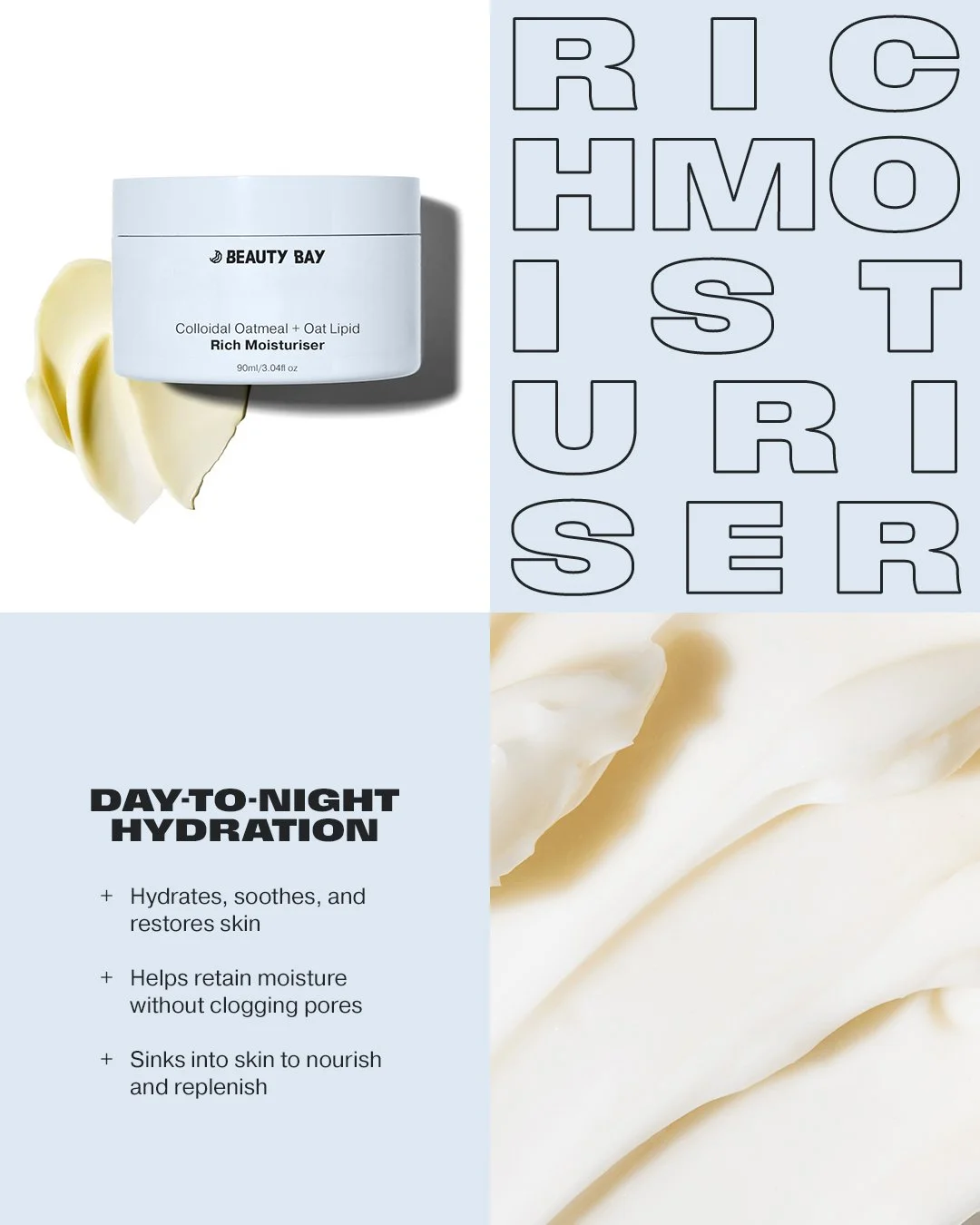
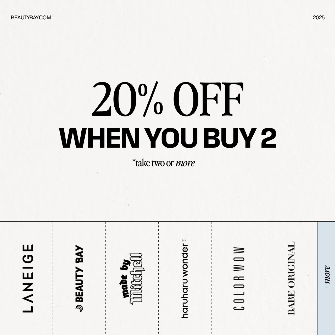
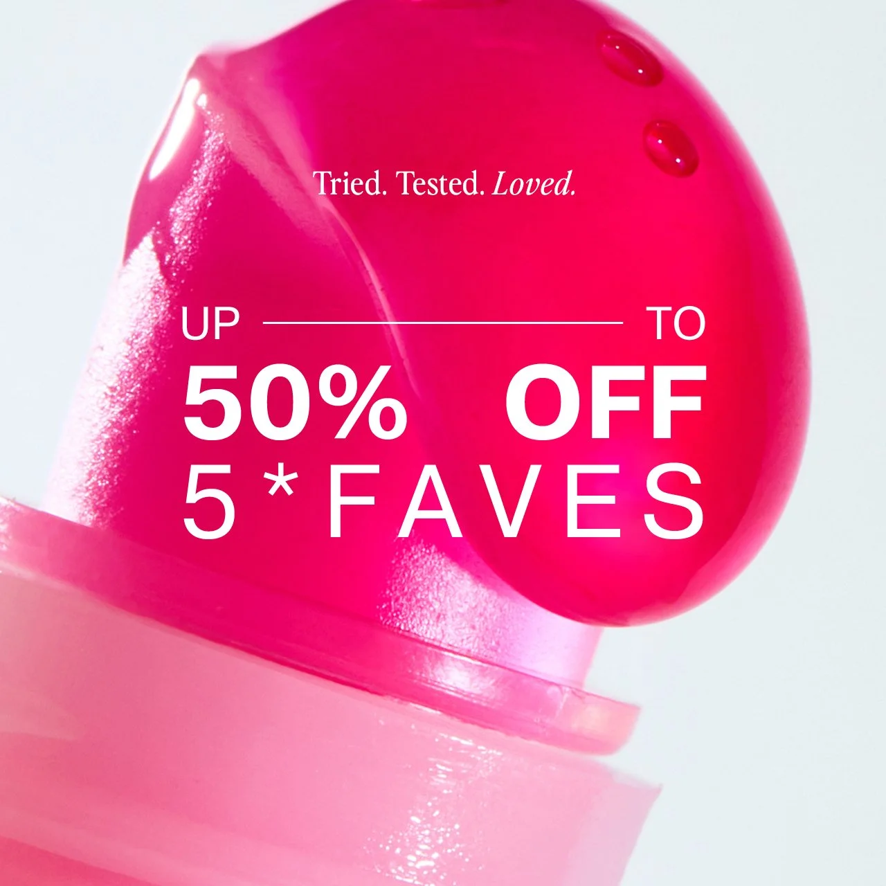
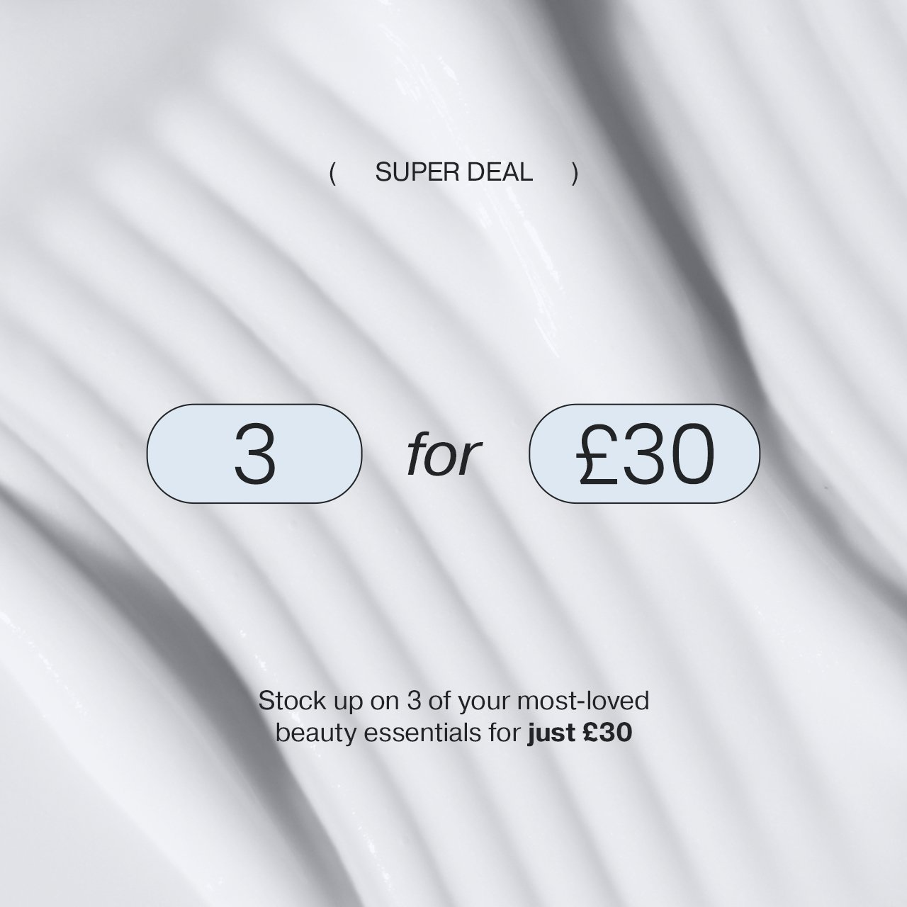
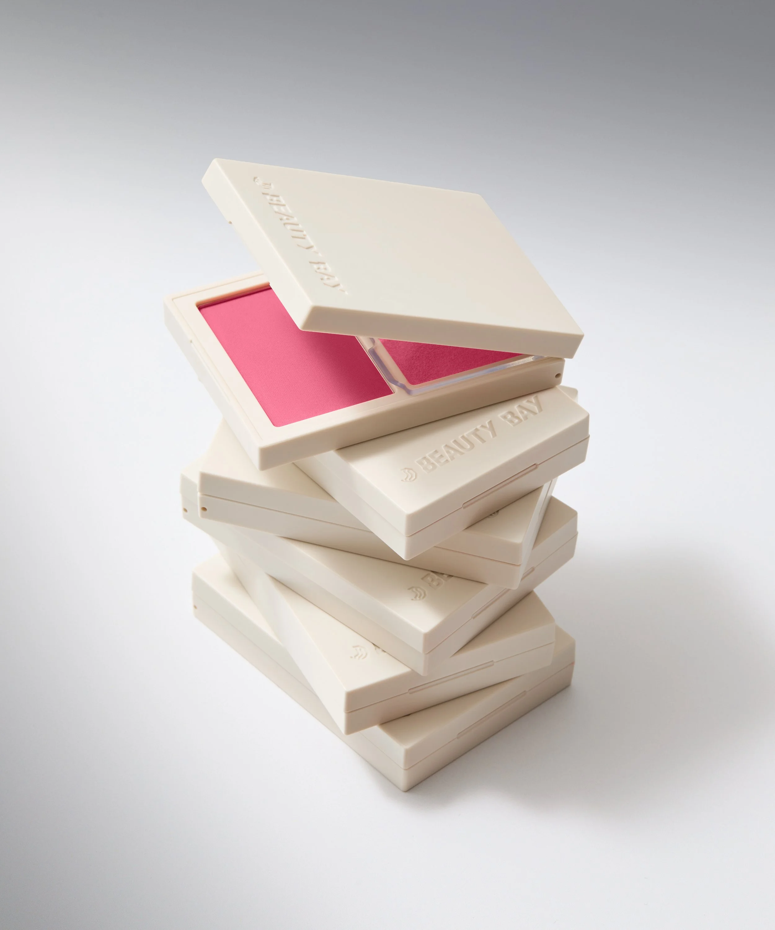
Output: A refined and streamlined brand identity built around a sleek muted colour palette, unified typography, and a confident, editorial graphic style. The new packaging system introduced consistency across all categories creating a cohesive shelf presence and stronger brand blocking. Minimal layouts, clean hierarchy, and intentional pops of colour elevated perceived quality while improving clarity and navigation for the customer. The refreshed graphic direction balances minimalism with playful expression: bold typography, layered layouts, aspirational model imagery, and product-led textures replaced overly busy or sales-heavy visuals. Promos are refined to feel fashion-inspired rather than discount-driven, supporting a more sophisticated brand perception. This new brand ecosystem is aimed at strengthening brand recognition, increase trust and desirability, and position Beauty Bay as a more premium, trend-forward authority in beauty creating a scalable foundation for future launches and category expansion.